


Maps that appear in a television show or movie are rarely central to the plot. Often, maps are shown as a background graphic like the wall map showing the station’s broadcast range behind the reception desk on WKRP in Cincinnati, or the computer screen interface maps showing the park system in Jurassic Park. Despite these mostly limited offerings, maps from a show or movie can still inspire their audiences and act as memorable pieces of creative flare.
My personal favourite use of maps within a television show comes from the sleepy animated series Downtown that aired on MTV for only one season in 1999. Beginning in the late 1980's and stretching into the mid-2000's, MTV's animation department experimented with a variety of cartoon styles intended for mature audiences. With the exception of the hit series Beavis & Butt-Head and its spin-off Daria, most of the series developed received low ratings and did not remain on air beyond a season or two.
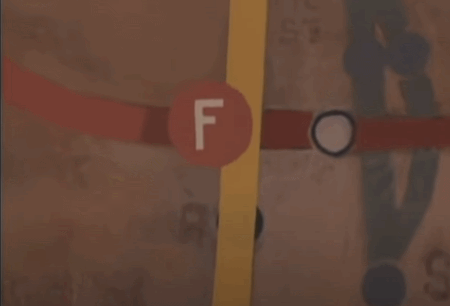
Downtown: Train Pain
Downtown told the story of everyday life for a group of young adults living in New York City. Each episode was based off interviews with real people and crafted into a narrative with stunning hand-drawn animation that featured surreal interludes and trippy aesthetics. The overall presentation was dark and gritty, which really captured the mood of a story being told at night in a large urban centre. Furthermore, the show's poor ratings and mature themes buried it into a midnight-or-later timeslot, at least in my cable package, so my only memories of it were catching it on a whim if I happened to stay up late on a Friday or Saturday night.
The series second episode, "Train Pain," saw characters race against one another to see who could reach Coney Island first using the subway system. It was a battle of sexes as Fruity and Matt were pitted against Chaka and Mecca, with the losing team forced to parade across the beach in the winning team's choice of swimwear.

Throughout the episode, the characters were constantly checking the best way to navigate the subway system using the wall maps at each station. Drawn in the same rough, grimy style as the show's background scenes, the cartography on display was a perfect fit as the maps looked naturally weathered and textured. The maps also came to life on screen with their system letter symbols moving along the system lines as the two teams progressed towards Coney Island. This technique really added to the feel of how important it was for each team to be on what they thought was the faster train.
Applying Techniques
I try to add rough washes or textures to most web maps that I make to give them this same weathered look. Using the ArcGIS Vector Tile Style Editor allows me to bring in my own patterns and textures. I've also made many animated maps – which can be as simple as a group of static images strung together as a GIF – to show progress over time for a given dataset. There are many options for working with temporal data in ArcGIS. Both techniques are present in "Train Pain," and I'll never know for sure if they seeped into my brain when I watched it for the first time in 1999 or 2000. But re-watching the episode over 20 years later, I like to think that they did.
Do you have a favourite map from a television show or movie? If you do, consider looking at it within the context of the overall story and how it adds to your enjoyment of the show or movie. You might find a few bits of inspiration for the next map you make.